Update 28/10/2024: interactive charts which use more than 1 data series are currently not loading correctly because something broke in the last few days server-side in google sheets, see e.g. test charts. When this issue is fixed I will revert to the interactive charts used formerly in this demo.
In this demo I investigate the monthly prices of a fictional stock ABC over a 3 year period, calculate simple risk and reward metrics, compare the distribution of returns to a theoretical Gaussian model, and compare the performance to the US market index as a benchmark over the same period.
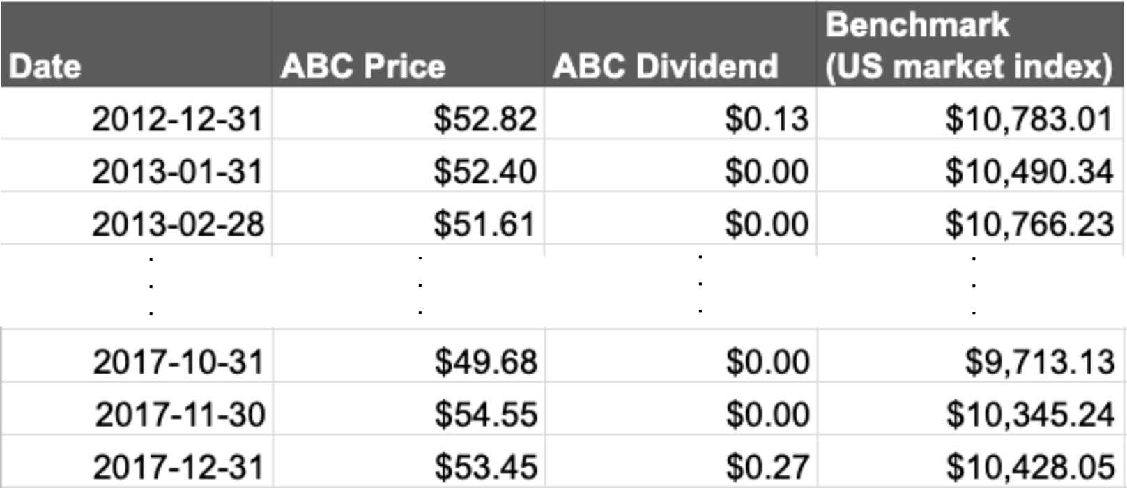
The raw data consisted of a series of historical prices and dividends for the stock ABC, the US market index over the same period, and the list of dates, see Table 1.
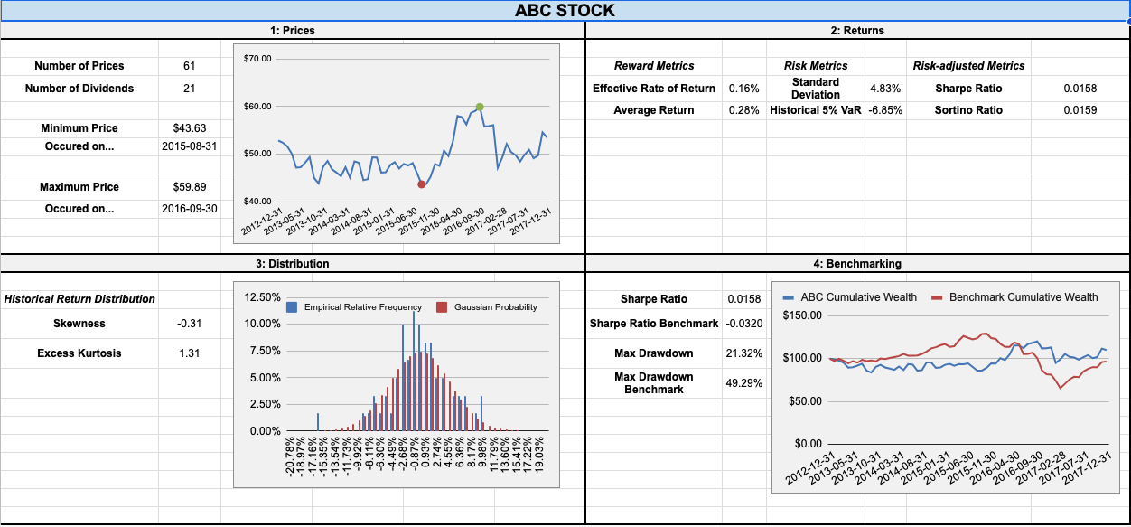
The simplest thing we can do with the raw data is probably a line chart of the monthly stock prices, Fig 2. There is an upward trend from the lowest price, $43.63, recorded on 2015-08-31, to the high price, $59.89, recorded on 2016-09-31.
Fig. 3 displays a bar chart of the % monthly returns grouped by month.
Plotting this gives us a quick way to see if there was any particular time of year that the stock did particularly well or poorly.
To generate this plot the % monthly returns were computed in a standard way (described in the next paragraph), and the built-in functions COUNTIFS() and MONTH() were used to find the total positive and negative returns from the 3 years of data.
As alluded to above, the percentage return gives an idea of the amount of money you make, or would potentially make, on an investment over a period of time. We can keep track of the investment by computing the series of historical returns \( \{ R_{1}, R_{2}, R_{3}, \dots, R_{N} \}\) on a monthly basis, and this represents the potential amount of money made from month to month. In plain English,
\begin{equation} \text{ % monthly return } = \frac{\text{final value } + \text{cash flows } - \text{initial value}}{\text{initial value}} \times 100. \end{equation}
The minimum potential return is -100% of the initial investment while the maximum is unbounded. These values also take into account any cash-flow received while holding the investment, i.e. the dividends. Since there are \(61\) prices available in the raw data, there are \(N=60\) historical returns (no return for the first price).
Given the series of historical returns, and the capital invested \( C \), the return on the investment after \( T\) months is \( C(1+R_{1})(1+R_{2})\dots(1+R_{T}) \). Here \( R_{1} \) represents the first % monthly return from when the capital is initially invested. In plain English, this is the compound effect of
\[ \text{wealth} = \text{wealth of previous month} \times (1 + \text{ % monthly return} ) \]
The effective rate of return \( R_{E}\) is a useful metric for evaluating the overall return on an investment. Mathematically it is the % return such that for the capital invested \( C \), the final cumulative wealth after \(T\) months can alternatively be calculated by \( C(1+ R_{E})^{T}\). The cumulative wealth for the stock ABC given an initial \(C = $ 100.00 \) is plotted in Fig. 4 alongside an equivalent investment in the US market index, i.e. the comparable result one would obtain by investing in the average performance of major companies traded in the US stock market. At the end of 2017, the final wealth is $110.05 for ABC and $96.71 for the benchmark.
Finally, the average rate of return \( R_{\text{av}}\) is simply the arithmetic mean of the series of historical returns and is computed in the spreadsheet with AVERAGE().
It therefore considers all returns to be independent, and, loosely speaking, can be used to infer the expected reward for future performance.
For the stock ABC, the two important reward metrics described above were found to be
\begin{align} R_{E} & = 0.16\% \\ R_{\text{av}} &= 0.28\%, \end{align}
while the benchmark had \(R_{E} = -0.06\%\) and naturally contains zero cash flow contributions in its calculation.
The volatility of stock returns captures the amplitude (or spread) of the price variations. A simple measure of this is the sample standard deviation \( \sigma \) of the series of historical returns. The higher the volatility, the large the amplitude of the past returns, and the riskier the stock. For stock ABC the result is
\[ \sigma = 4.83\% \]
and is calculated with the function STDEV() in the spreadsheet.
Another popular indicator to quantify risk is the historical value-at-risk (VaR).
The 5% VaR is the value below which 5% of returns were observed, illustrated in Fig. 5.
It is conveniently calculated with an in-built spreadsheet function: =PERCENTILE(cell_range,0.05), where cell_range contains the series of returns.
The result is
\[ \text{5% VaR for ABC} = -6.85\%,\]
which indicates there is a 5% chance of losing more than 6.85% per month.
To assess the reward obtained per unit of risk taken, the most popular risk-adjusted metric is the Sharpe ratio. This is defined as the excess reward divided by the volatility:
\[ \text{Sharpe ratio} = \frac{R_{E} - r_{f}}{\sigma} \]
where \(r_{f}\) represents the risk-free rate (commonly taken as the short-term interest rate of US treasury bills issued by the US government). The larger the Sharpe ratio, the better your investment. I assumed a risk-free rate of 1% per year, which equates to a monthly risk-free rate of \( r_{f} = 0.08\% \). For stock ABC, the result is
\[ \text{Sharpe ratio for ABC} = 0.0158 \]
Since the Sharpe ratio in this case is a positive number, the investment was more profitable than investing in the risk-free rate. In contrast, the benchmark’s Sharpe ratio is negative:
\[ \text{Sharpe ratio for the benchmark} = -0.0320 \]
which confirms that not only did ABC outperform the benchmark, but also that investing in the risk-free rate was more profitable than investing in the benchmark.
A second risk-adjusted metric is the Sortino ratio, which, unlike the Sharpe ratio, takes into account that large “volatility” above the average of historical returns is actually good for investors. Therefore we can argue that only below-average returns should be used to measure volatility, and for this reason, the Sortino ratio is the excess reward divided by the the semideviation \(\sigma_{\text{smd}}\), which is the standard deviation of just the below-average returns.
Calculation details for \(\sigma_{\text{smd}}\) are described in the appendix. For Stock ABC the semideviation is \( \sigma_{\text{smd}} = 4.79 \%\), which is lower than the volatility, so the Sortino ratio is larger than Sharpe ratio:
A simple histogram with 30 bins for the 60 empirical % monthly returns is plotted in Fig. 6 alongside a standard Gaussian distribution using the same mean and variance, calculated using the NORMDIST() function in the spreadsheet.
Details of the histogram construction are available in the tab “Histogram details” in the spreadsheet.
The Gaussian model’s 5% VaR is possible to calculate using the NORMINV() spreadsheet function:
Since this is less than the 5% historical VaR of stock ABC (which was -6.85%), the model is more conservative than the empirical data. If a lower level was picked, say 0.01 instead of 0.05, then the model would become less conservative, because the tails of a Gaussian model are typically thinner than empirical data.
We can also measure the skewed-ness and tailed-ness of the empirical data to compare it to the Gaussian model, using SKEW() and KURT():
A negative skewness and a positive excess kurtosis confirm that the distribution of returns is slightly left-skewed, and that extreme returns are more present in the dataset than under the Gaussian model. This is to be expected, because empirical data for financial returns sometimes exhibit very large returns and have a tendency to be left-skewed.
Beyond simply comparing the cumulative wealth of stock ABC to the benchmark, shown earlier in Fig. 3, or comparing simple metrics like the Sharpe or Sortino ratios, we should also take into account capital preservation.
In particular, a drawdown analysis is useful to assess how dangerous a stock is, which shows the peak-to-trough decline of the value of the investment over time, Fig. 7. The drawdown at a given date is defined as the current price divided by the historical maximum so far, minus one. Competitors with similar cumulative wealth performance can be distinguished by their maximum drawdown, usually quoted as a positive %.
The benchmark suffered a maximum drawdown of almost 50%, which is dangerous for capital preservation and more than twice the maximum drawdown of stock ABC:
ABC therefore tremendously outperformed its benchmark according to this metric.
We can also investigate the correlation between stock ABC and the market index benchmark, which, roughly speaking, allows us to answer questions like “What happened to stock ABC when the US market increased?”, and also allows us to investigate patterns in their co-movement.
We do this by calculating the Pearson correlation coefficient with PEARSON() or CORREL() in the spreadsheet.
This is a number between -1 and 1: a value of 1 indicates the returns are perfectly correlated, always moving in the same direction; a value of -1 indicates perfect anti-correlation, always moving in different directions; and a value of zero indicates no relationship between the movements.
Using all of the available data, we find
\[ \text{Pearson correlation coefficient} = 0.29 \]
which indicates the assets are moderately correlated.
Correlation typically increases during crisis periods, during which people tend to sell the assets they own, leading to excess supply compared to the demand for the assets, and a generalized decline of prices. This can be investigated with a rolling window analysis of the correlation coefficient, Fig. 8. In this case, it shows us that the correlation is unstable.
To calculate the effective rate of return \(R_{E}\), we can invert the defining equation \( C(1+R_{1})(1+R_{2})\dots(1+R_{T}) = C(1+ R_{E})^{T} \) to find
\[ R_{E} = -1 + [(1+R_{1})(1+R_{2})\dots(1+R_{T})]^{1/T} \]
which is simply negative one added to the geometric mean of (1 + monthly return).
This is calculated via =ARRAYFORMULA(GEOMEAN(1+ cell_range)-1) where cell_range contains the series of monthly returns.
The volatility for stock ABC was computed as a sample standard deviation \( \sigma \) of the full series of \( N \) historical returns \( R_{i} \)
\[ \sigma = \sqrt{\frac{\sum_{i=1}^{N} (R_{i}-R_{\text{av}})^{2}}{N-1}} \]
in which \( R_{\text{av}} = \sum_{i=1}^{N} R_{i} / N \) is the average return.
This is calculated using the inbuilt function STDEV().
For computing the semideviation, used for the measure of spread in the Sortino ratio, we instead have to calculate
\[ \sigma_{\text{smd}} = \sqrt{\frac{\sum_{i=1}^{L} (R_{i}^{*} -R_{\text{av}})^{2}}{L}} \]
where \( \{ R_{1}^{*},R_{2}^{*},\dots,R_{L}^{*} \}\) is the subset of \( L \) historical returns which are less than the average value: \(R_{i}^{*} < R_{\text{av}}\).
In this case a new column of data for \( (R_{i}^{*} -R_{\text{av}})^{2}\) was created, and then \(\sigma_{\text{smd}}\) was calculated using =SQRT(SUMIFS(cell_range1,cell_range,"<"&ABC_R_av)/COUNTIFS(cell_range,"<"&ABC_R_av)).
Here cell_range1 is the new column of data, cell_range is the series of monthly historical returns, and ABC_R_av is the named range for the cell containing \(R_{\text{av}}\).
Thanks to Dr David Ardia for the DataCamp class Financial Analytics in Spreadsheets, from which the fictional stock ABC data seen in Table 1 was taken. All data analysis and any errors are my own work.